


Company name: Leal (CO)/2021
Role: Senior UX/UI Designer
Challenge: Redesign existing app
Leal is a loyalty and rewards app that helps users save money while shopping. By earning points and virtual currency, users can redeem rewards for products and services at partner stores. The app is available in several Latin American countries and has around 7 million users.
Improving the overall app experience was crucial to addressing the obstacles users faced. It was necessary to make deeper changes beyond just visual enhancements to minimize bounce rates, incomplete tasks, and user complaints. These improvements aimed to simplify the user journey while also helping the business reduce process-related costs.
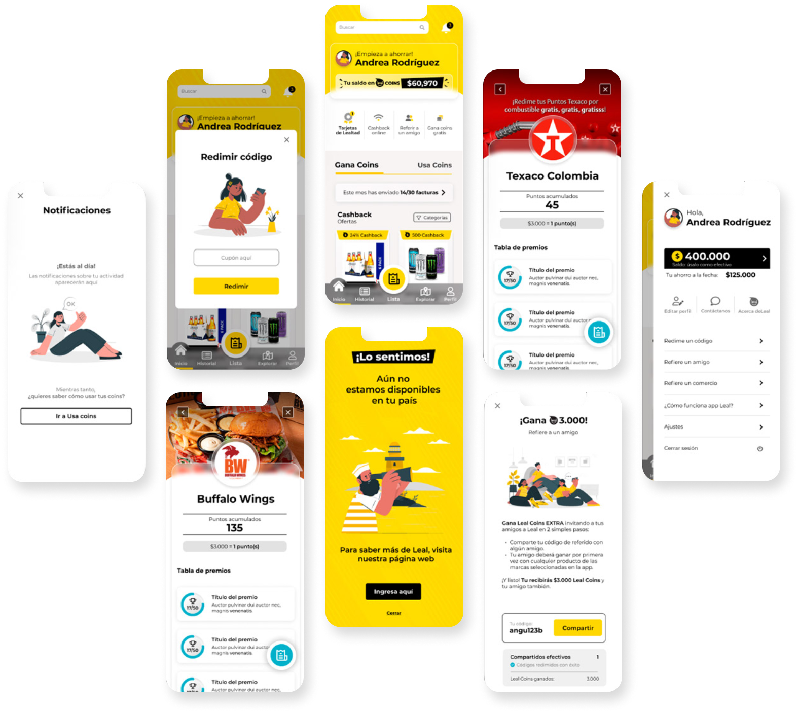
In addition to giving the app a fresh new design, several improvements were necessary. There were serious usability issues, unclear information architecture that made navigation confusing, and a lack of visual consistency throughout the app. Overall, the user experience was far from optimal.
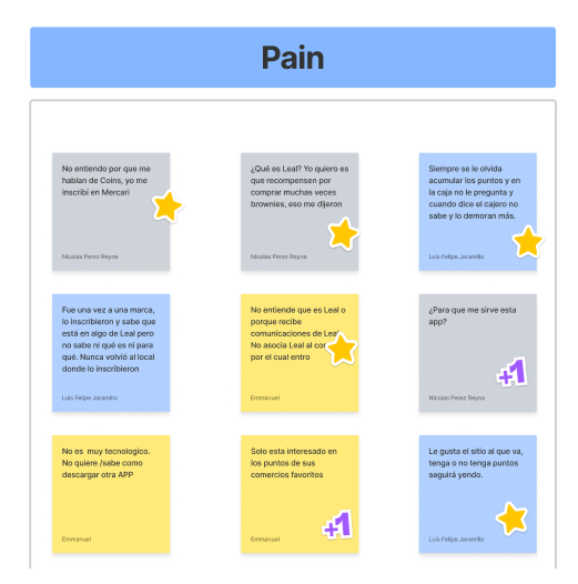
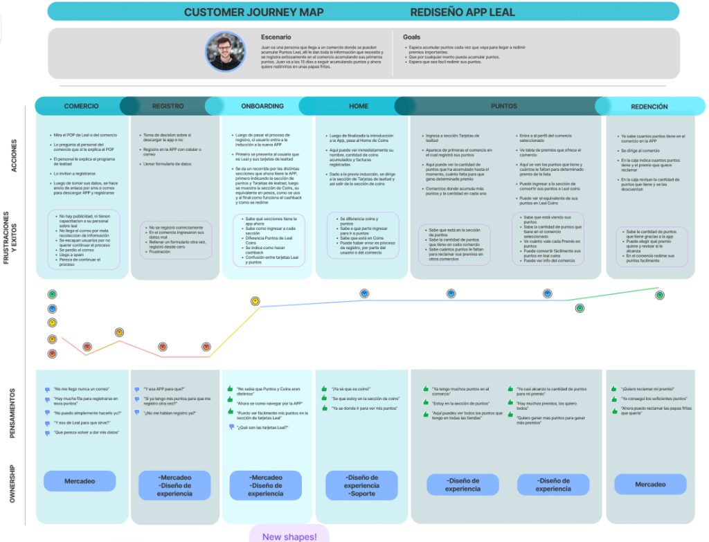
The first step was to conduct a comprehensive diagnosis of the app’s pain points by analyzing key metrics, user feedback, and complaints. This provided a clearer understanding of the main challenges to address.
Restructuring the information architecture and main navigation was crucial to eliminating unnecessary paths and components, streamlining the user experience.
Due to time and resource constraints, the research process was limited to a few direct user approaches, including surveys, interviews, and basic A/B testing. We also relied on insights from stakeholders and different teams to better understand our audience.
From this, we developed proto-personas to define our target users more clearly. By leveraging empathy-driven artifacts, we gained deeper insights into user needs and their key tasks within the app—many of which were previously unclear or entirely new to the business.
Finally, for the user interface redesign, we worked closely with the development team to restructure key components and tasks. We implemented proper feedback mechanisms for various user actions, such as empty states and error messages, and refined the app’s language and brand personality to enhance clarity and engagement.
Best practices were applied in areas like user data collection, contextual onboarding, and error recovery to improve the overall experience.
To ensure visual consistency, we standardized iconography styles, the color palette, and other design elements—culminating in the creation of a comprehensive design system.