


Company name: Indra (CO)/2021
Role: UX/UI Designer
Challenge: Redesign Digital Concierge managment tool
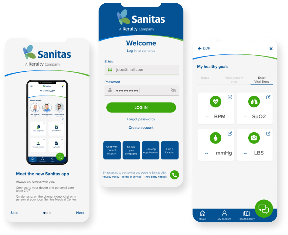
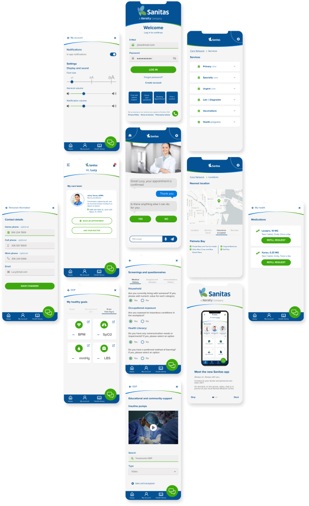
The Sanitas S.A. (US) Digital Concierge tool was designed to help users across multiple states manage their health insurance services seamlessly. It provides direct and easy access to medical records, prescriptions, and appointment scheduling, all in one platform.
Although the primary goal was to facilitate self-management of services and reduce operational costs, some users (particularly older adults and those less familiar with technology) struggled to understand and use the tool. As a result, many continued visiting medical offices in person, diminishing the tool’s value for them.
Due to low user engagement, the tool was not achieving its primary goals. From a business perspective, cost savings were not being realized, as many users continued visiting physical offices for basic tasks. Additionally, support lines were frequently used for inquiries and assistance with the tool, further increasing operational costs.
To better empathize with and understand our users, we created various artifacts (including proto-personas, surveys, and empathy maps) to clearly define each user segment. By involving other teams, we gained deeper insights into the barriers and complaints users faced throughout their journey.
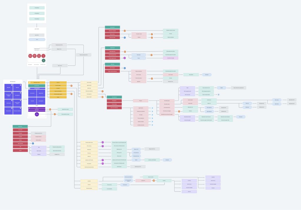
Based on our research, we developed user stories and mapped the user journey around key needs. We then audited the information architecture of the current version (considering both desktop and mobile platforms) streamlining and simplifying navigation paths to make them more intuitive and reduce cognitive load.
One major improvement was the creation of an omnichannel experience within the tool, ensuring users had easy access to guidance not only on how to use the tool but also on managing their services effectively.
Based on our findings, we designed low-fidelity wireframes to structure the overall experience and began testing new features to ensure they were clear to users and aligned with business requirements.
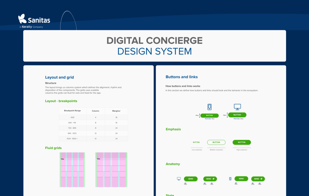
We developed multiple prototypes and iterated on them based on stakeholder feedback and insights. After refining the prototypes, we moved forward with the final designs for both web and mobile platforms and then established a cohesive Design System.